ARCHIVED WORK
Creating a Brand for Comma-Con
Role: Art Director
Client: Facebook
Software: .AI, .PS, .INDD
2018
.
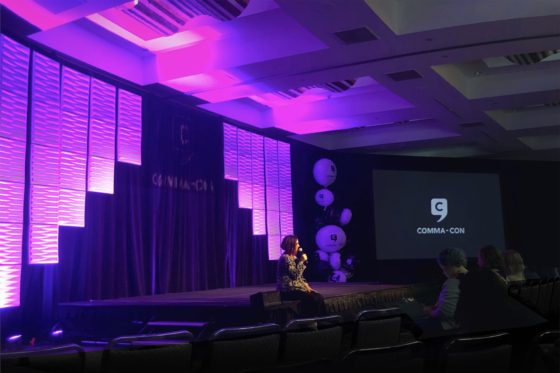
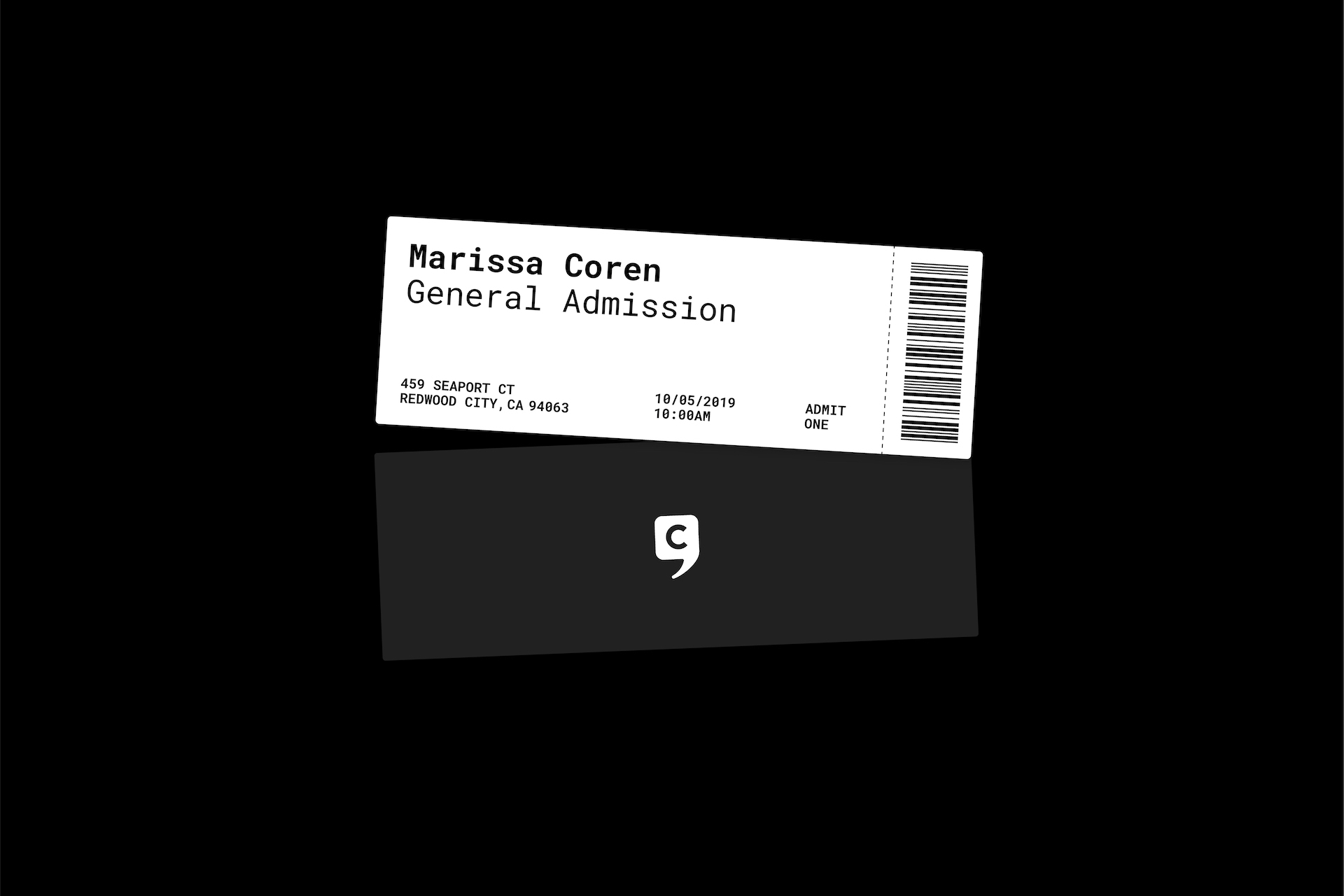
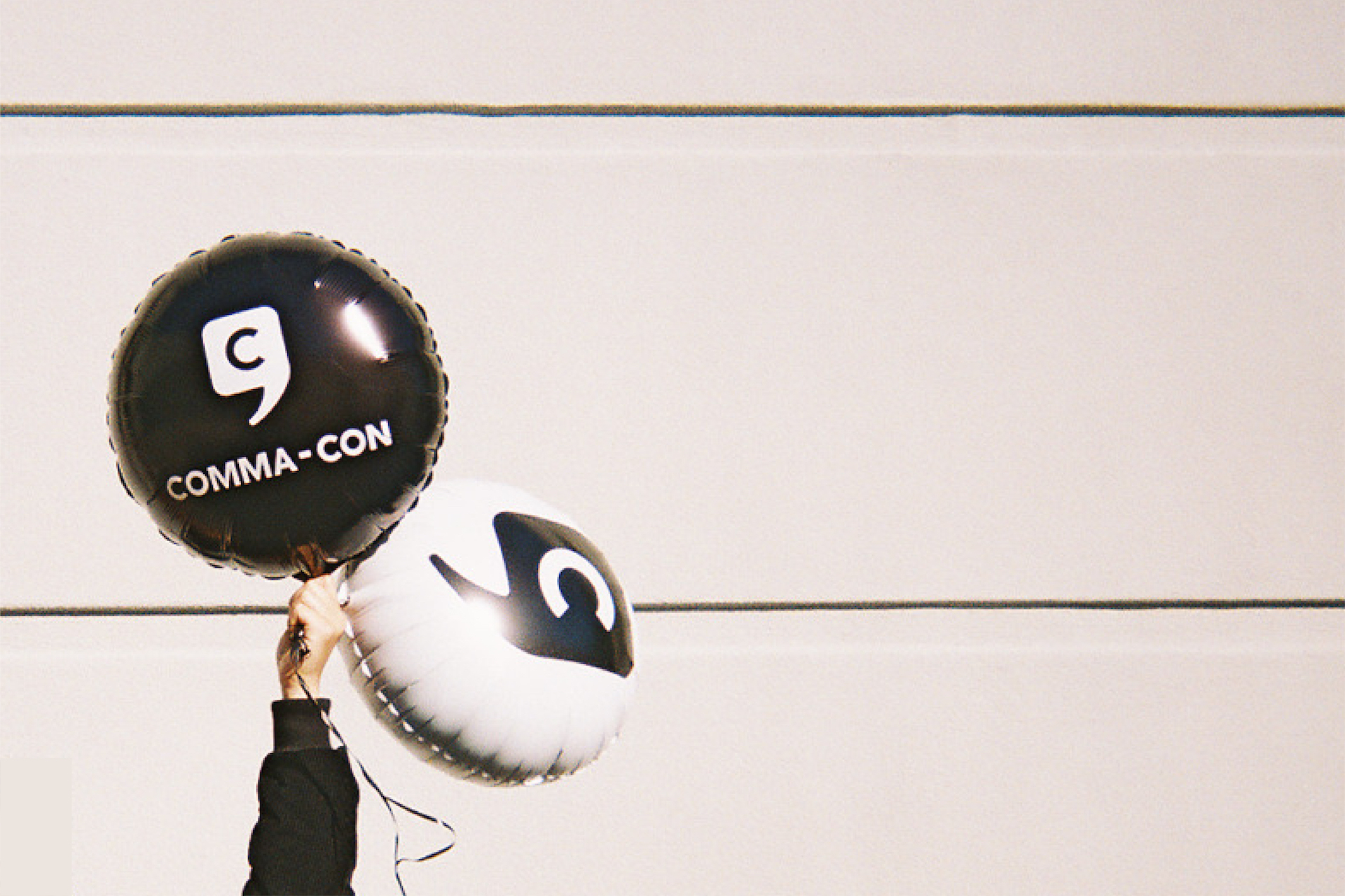
Facebook needed a visual identity for their annual Content Strategy conference. The Comma-Con brand would be used for the conference's overall identity whereas the annual conference theme would change year-to-year.
This required creating two brands: the parent (Comma-Con) and child (2018's theme, Design for Good). Both brands lived under the larger Facebook brand — associated most commonly by Facebook's enclosed-F logo.

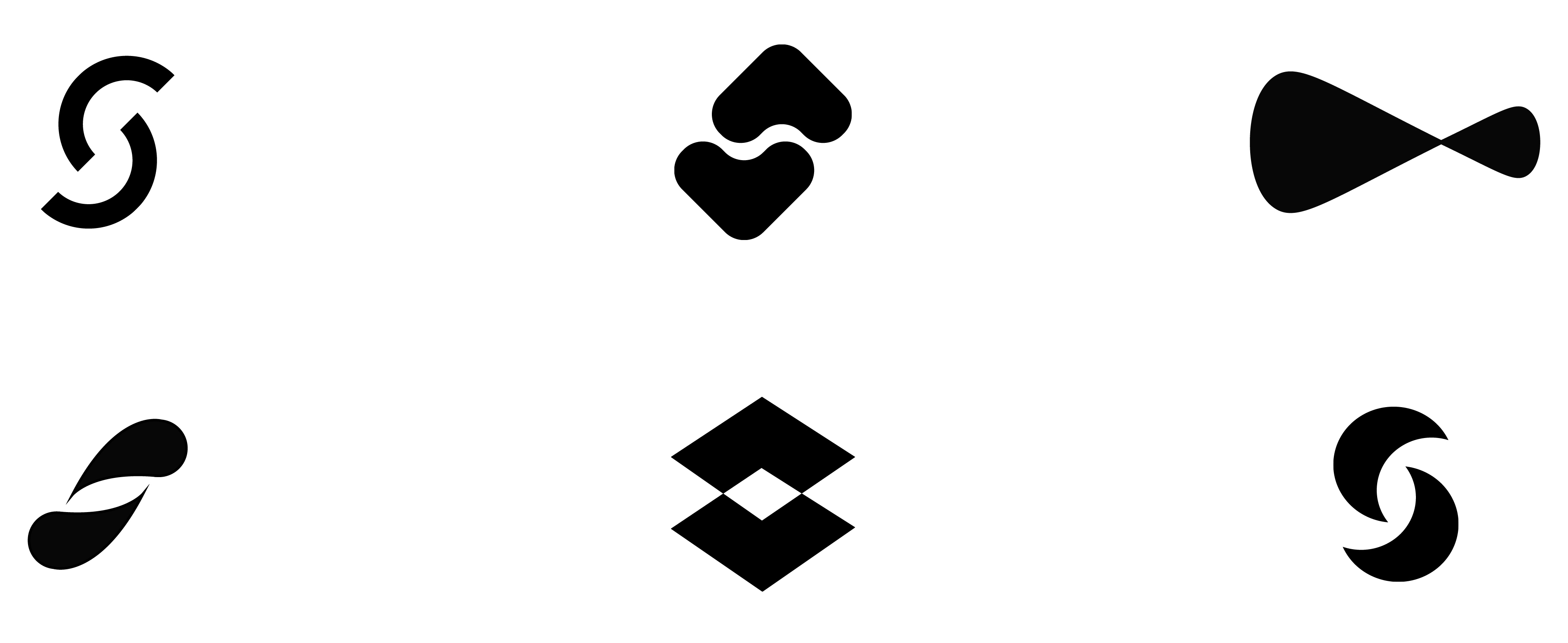
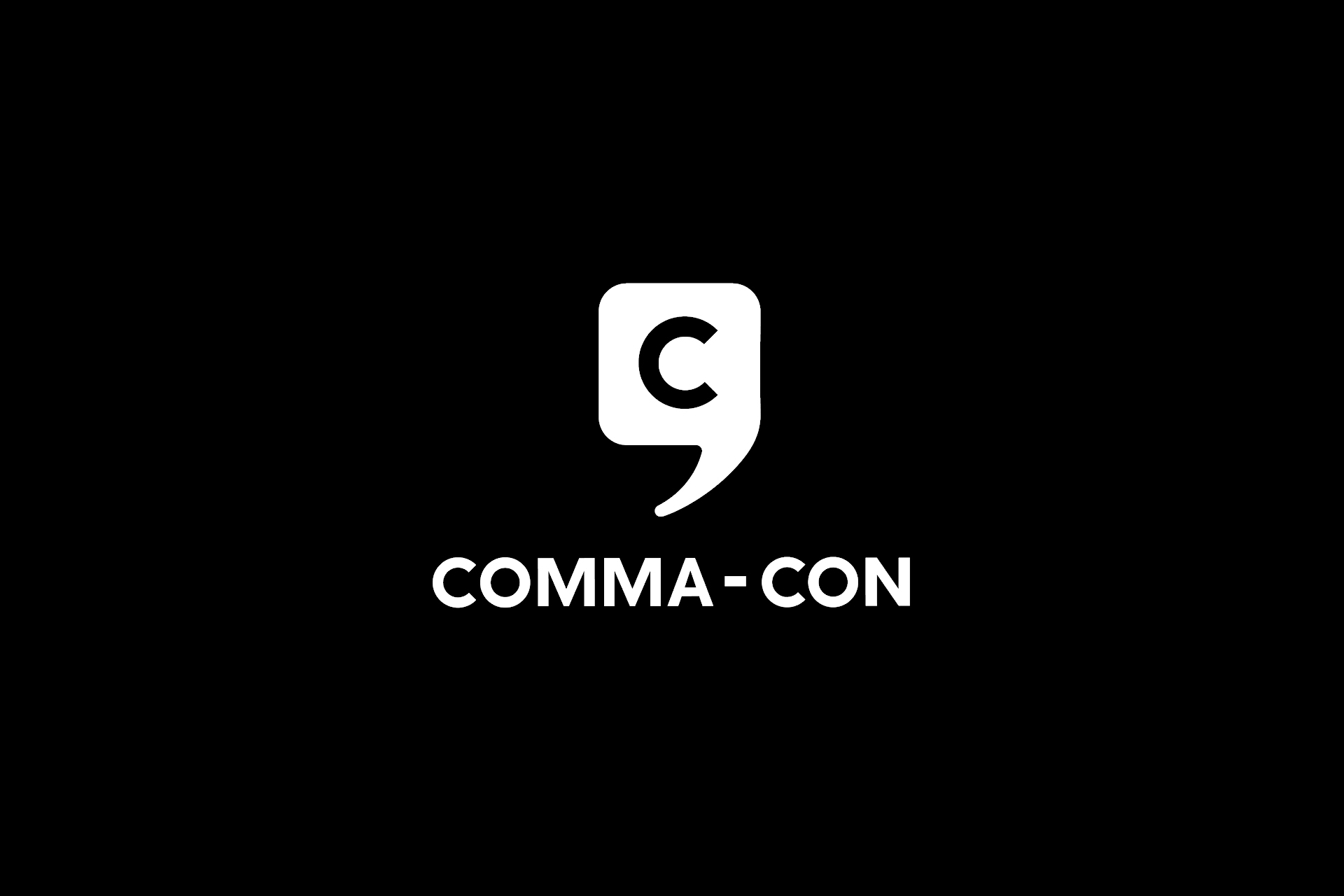
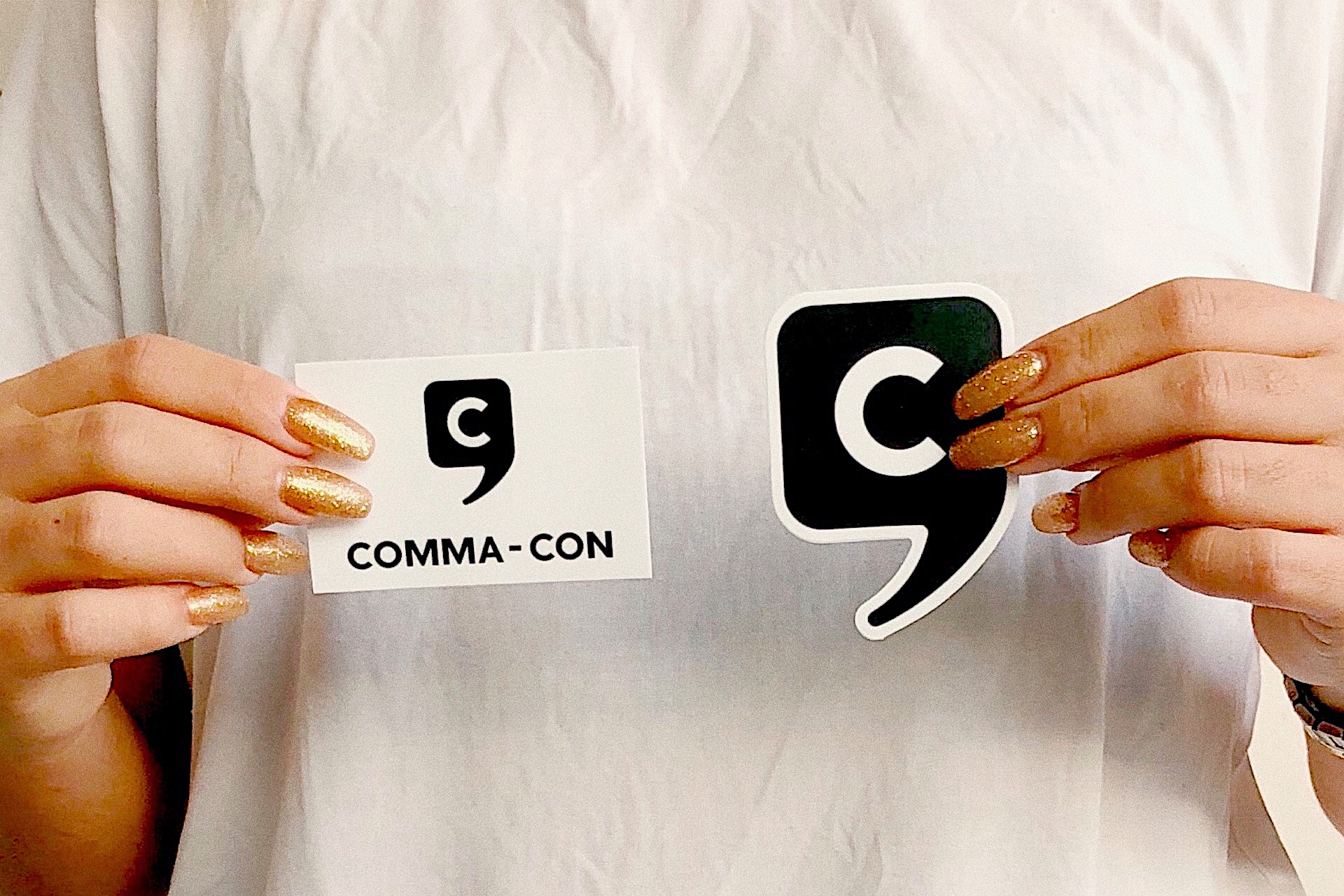
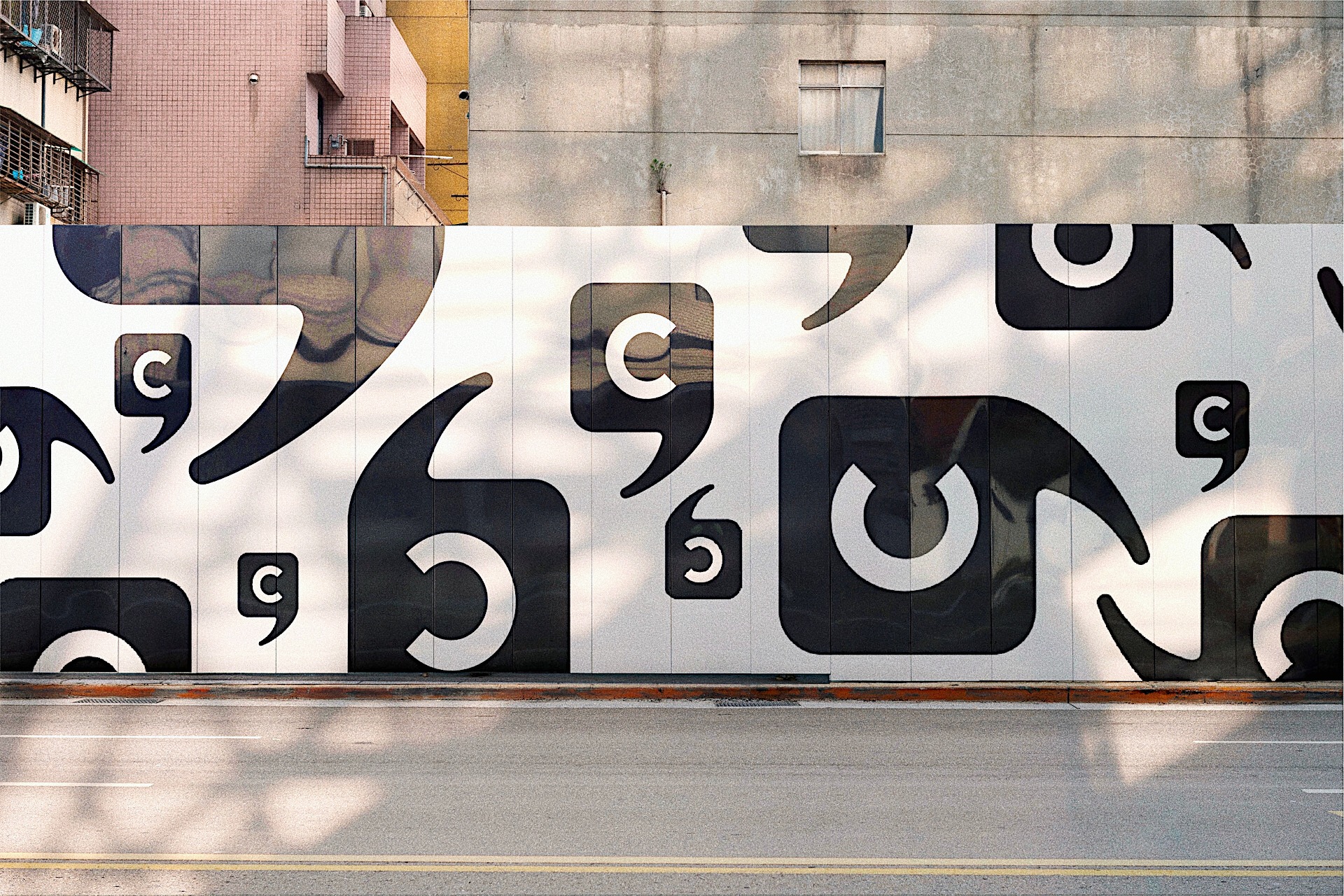
What’s the relationship between a comma and the letter C? Exploring this relationship between the curvalinear swoops of both the punctuation and letter, I did variations to display how both marks could live both together and within each other.
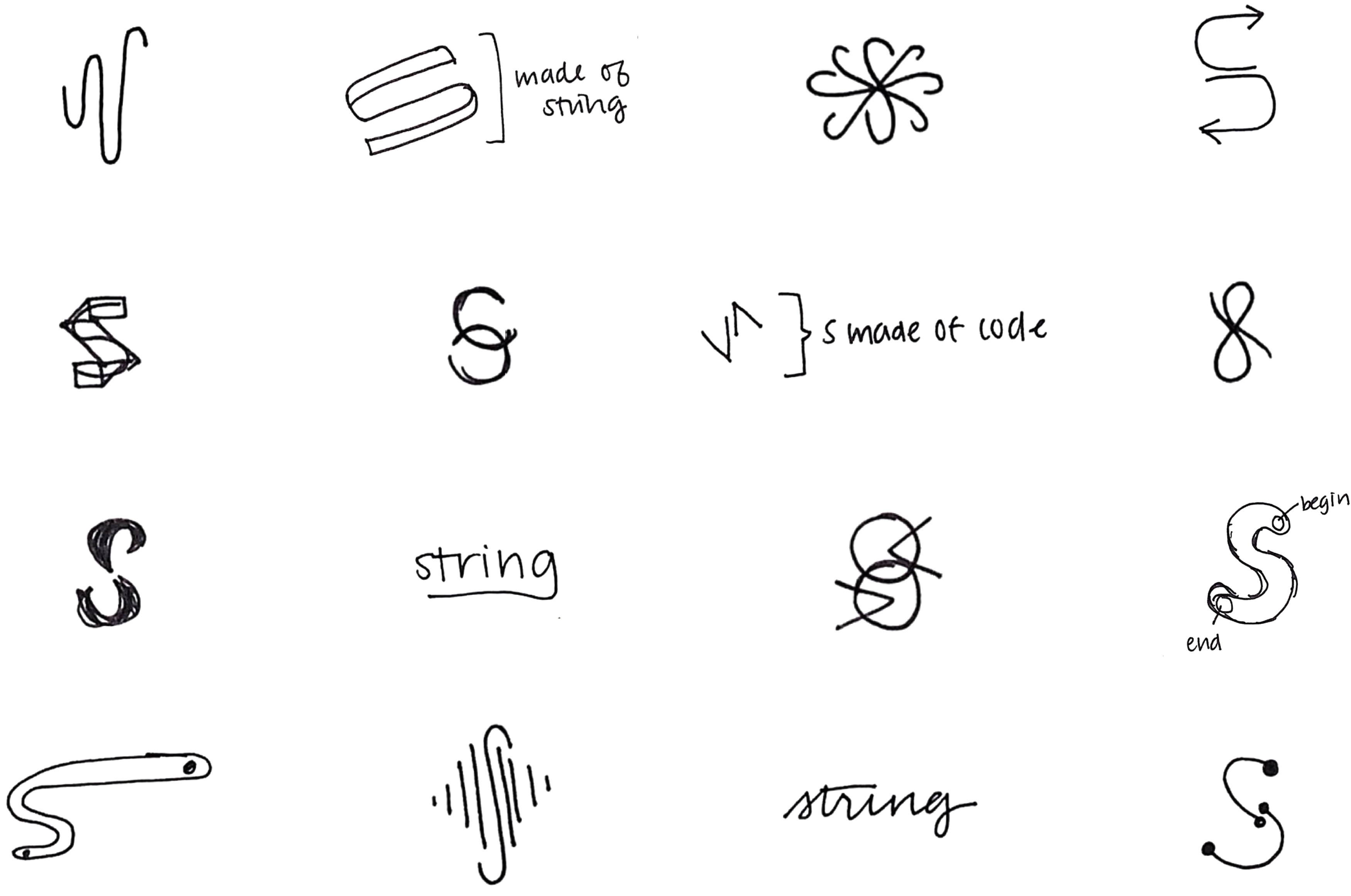
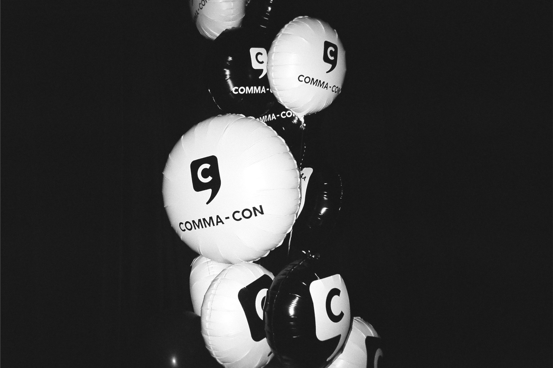
The final logo worked independently as the conference’s general logo while pairing well with future typefaces/marks for the yearly conference theme. The knockout letter and neutral type felt like this was the younger sibling of Facebook, the parent company. The brand’s colors, black and white were intentionally neutral to scale for any additional color from the annual conference theme
Credits:
Programming Director: Davina Baum
Marketing: Jen Davies, Shelly White, Yanisa Velez, Julia Wayne
Art Director: Will Scharlott