
ARCHIVED WORK
Redesigning MiO Water Enhancers for Health Benefits
Role: Design Intern, Landor
Client: Mio, Kraft Food Inc.
Software: .AI, .PS
2015
.
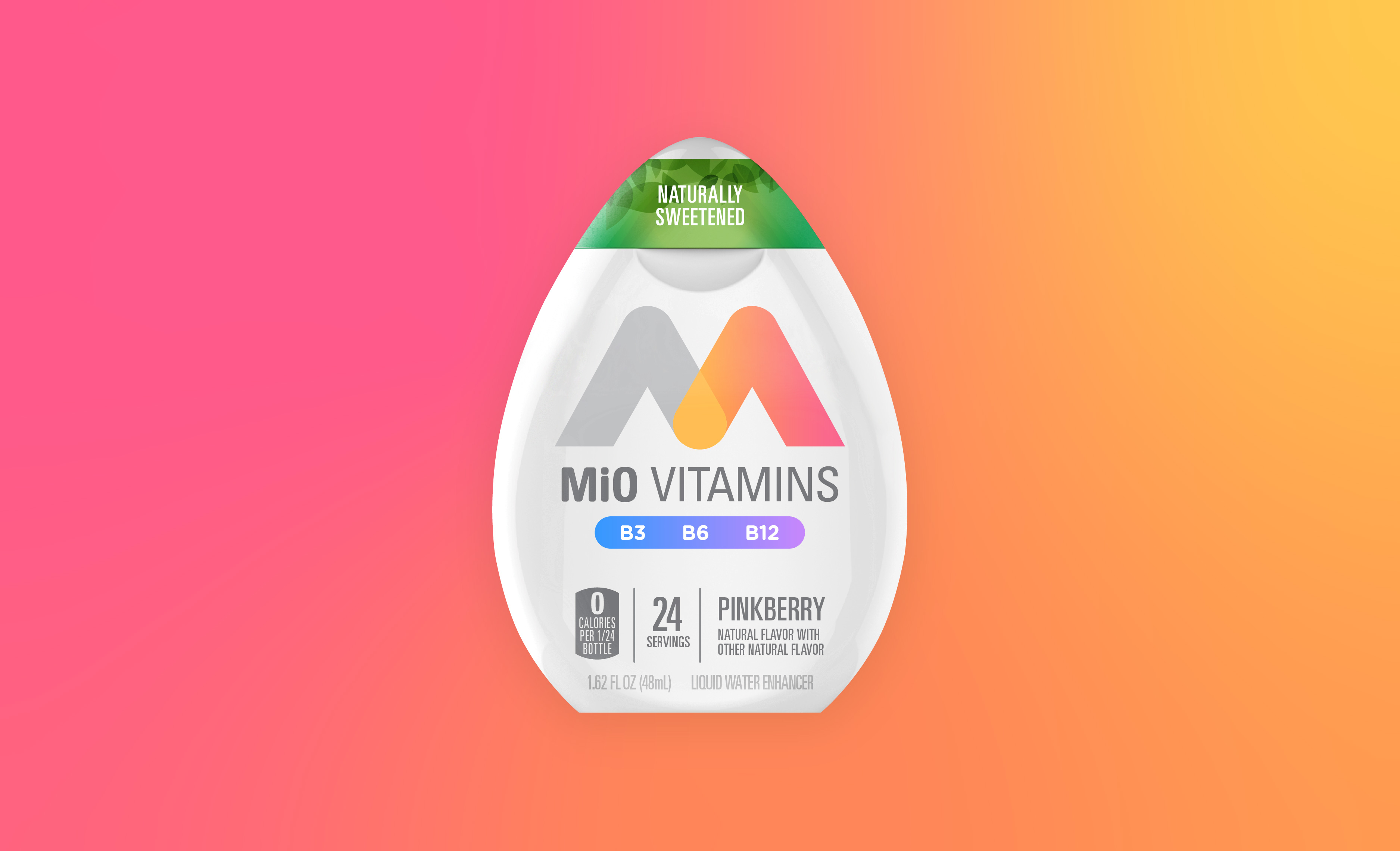
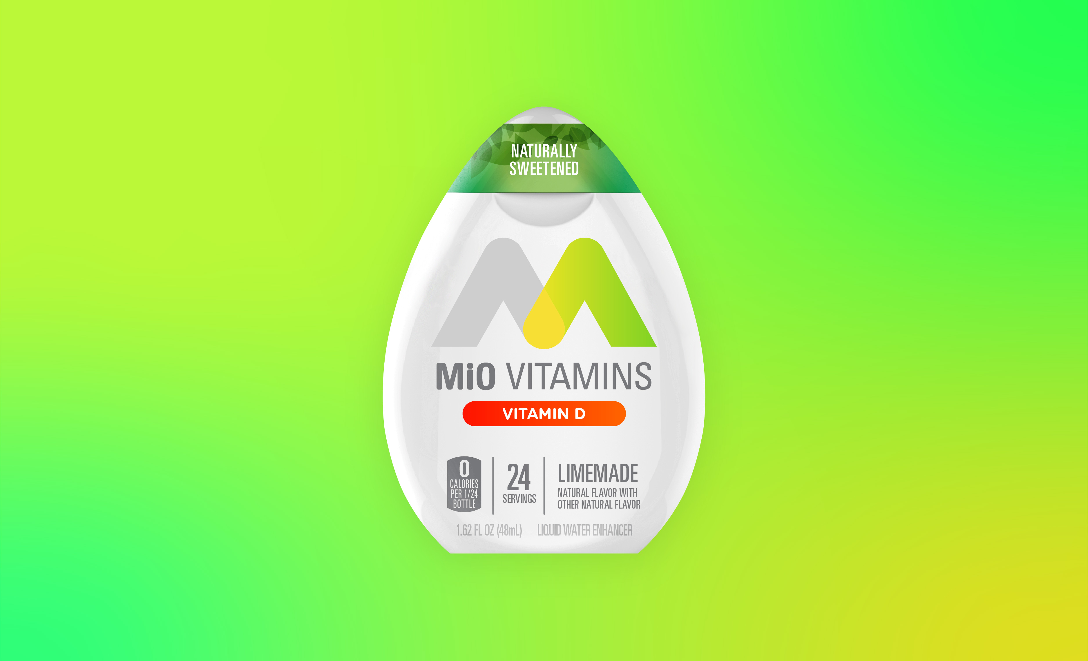
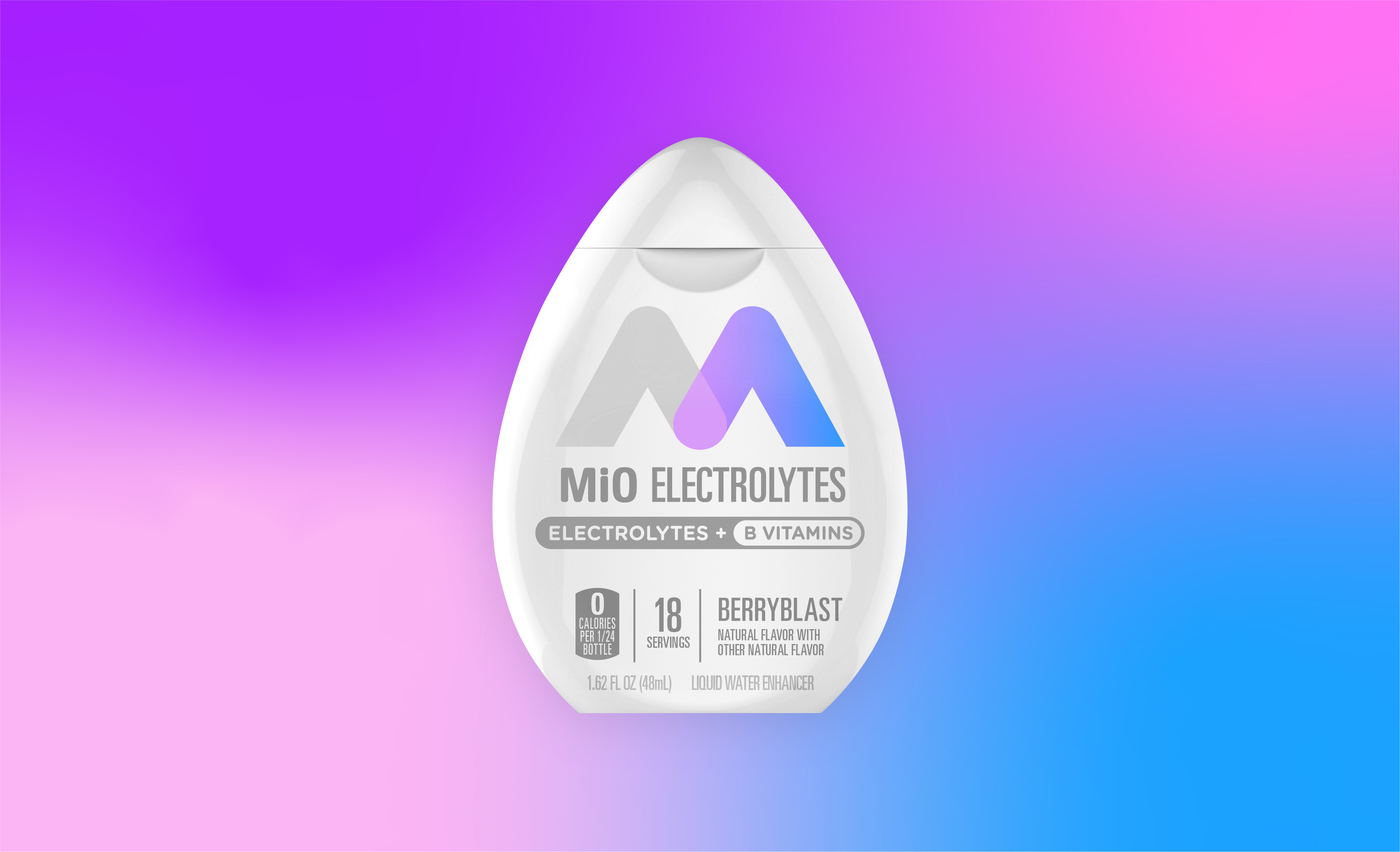
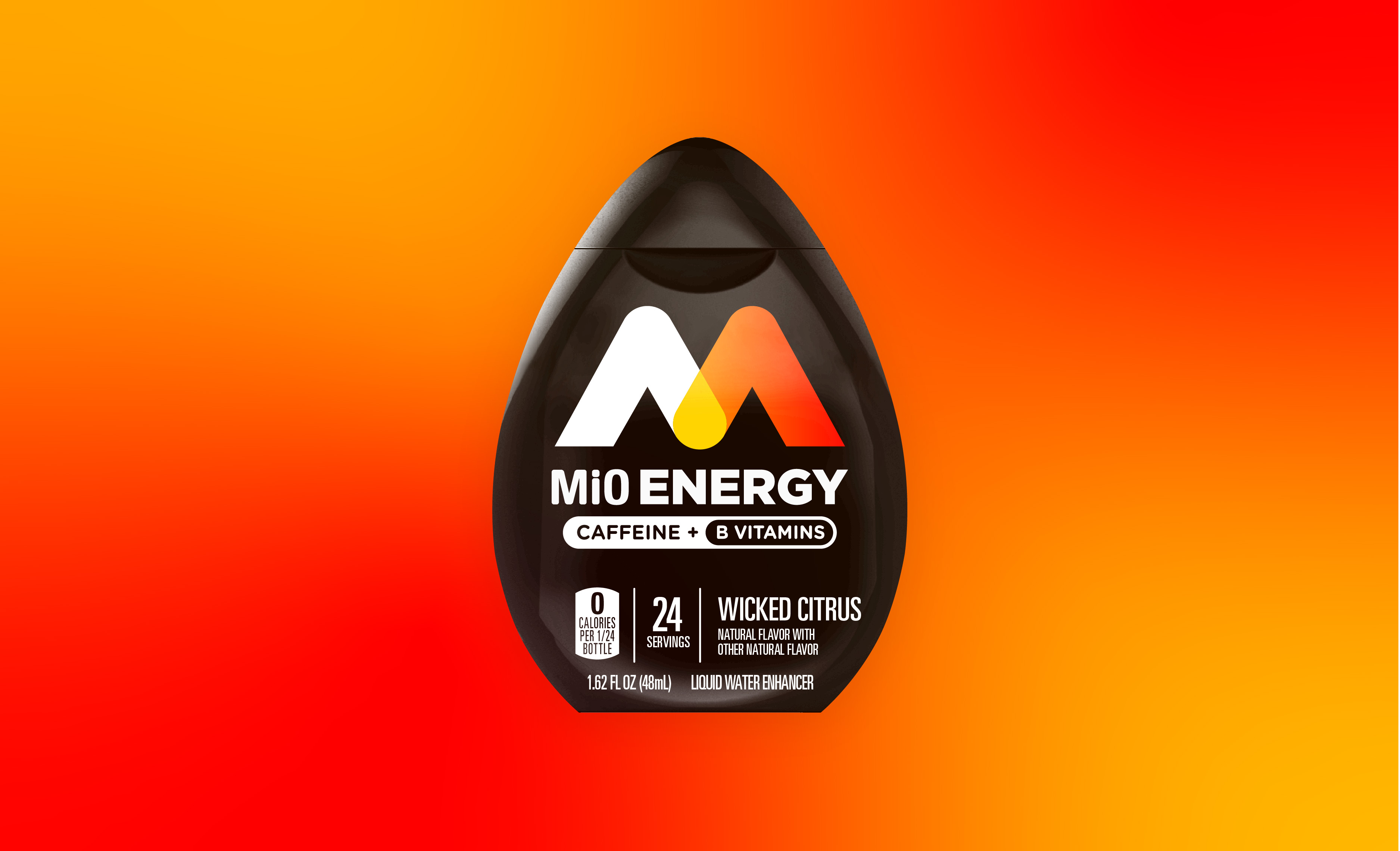
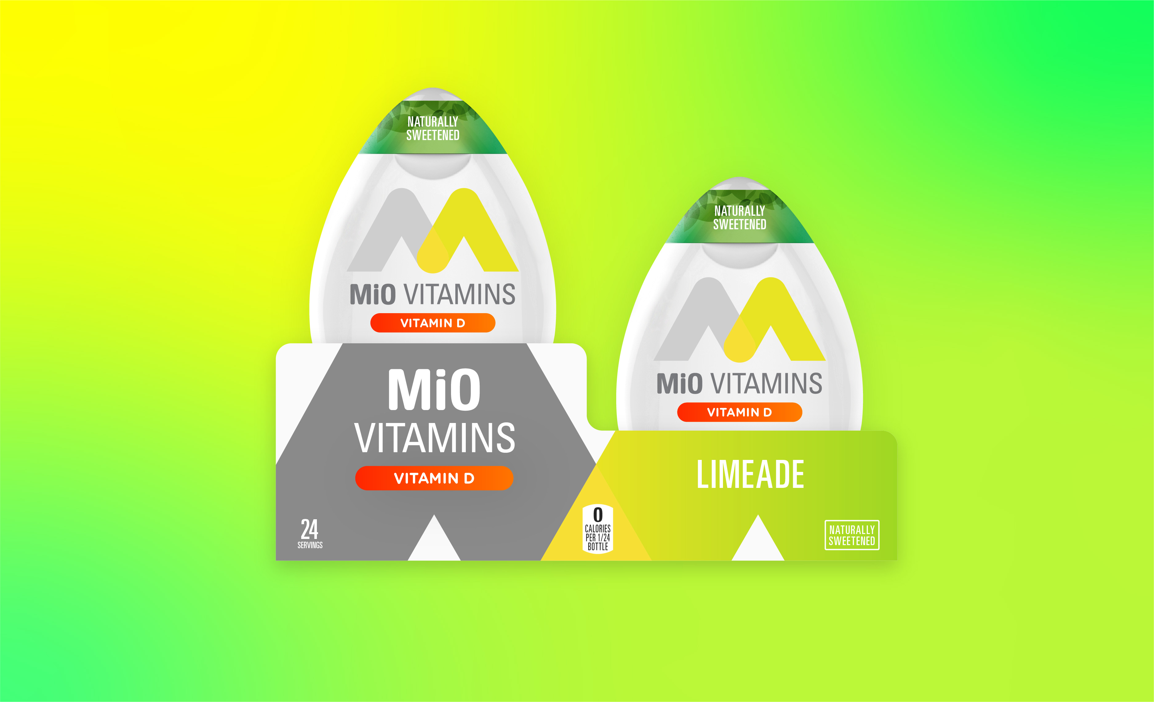
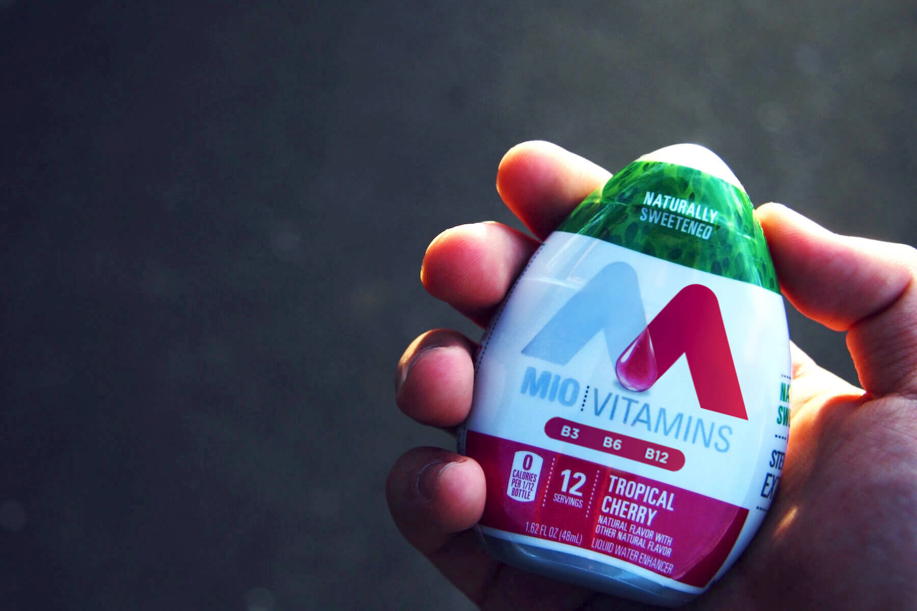
MiO Water Enhancers needed updated and contemporary packaging to show off new health benefits on three new products: MiO Vitamins, Energy and Electrolytes. Kraft wanted each product to distinctly communicate the consumer's benefit. During my internship at Landor, MiO became my main project as I took on multiple graphic treatments.
MiO is now available in stores, nationwide.
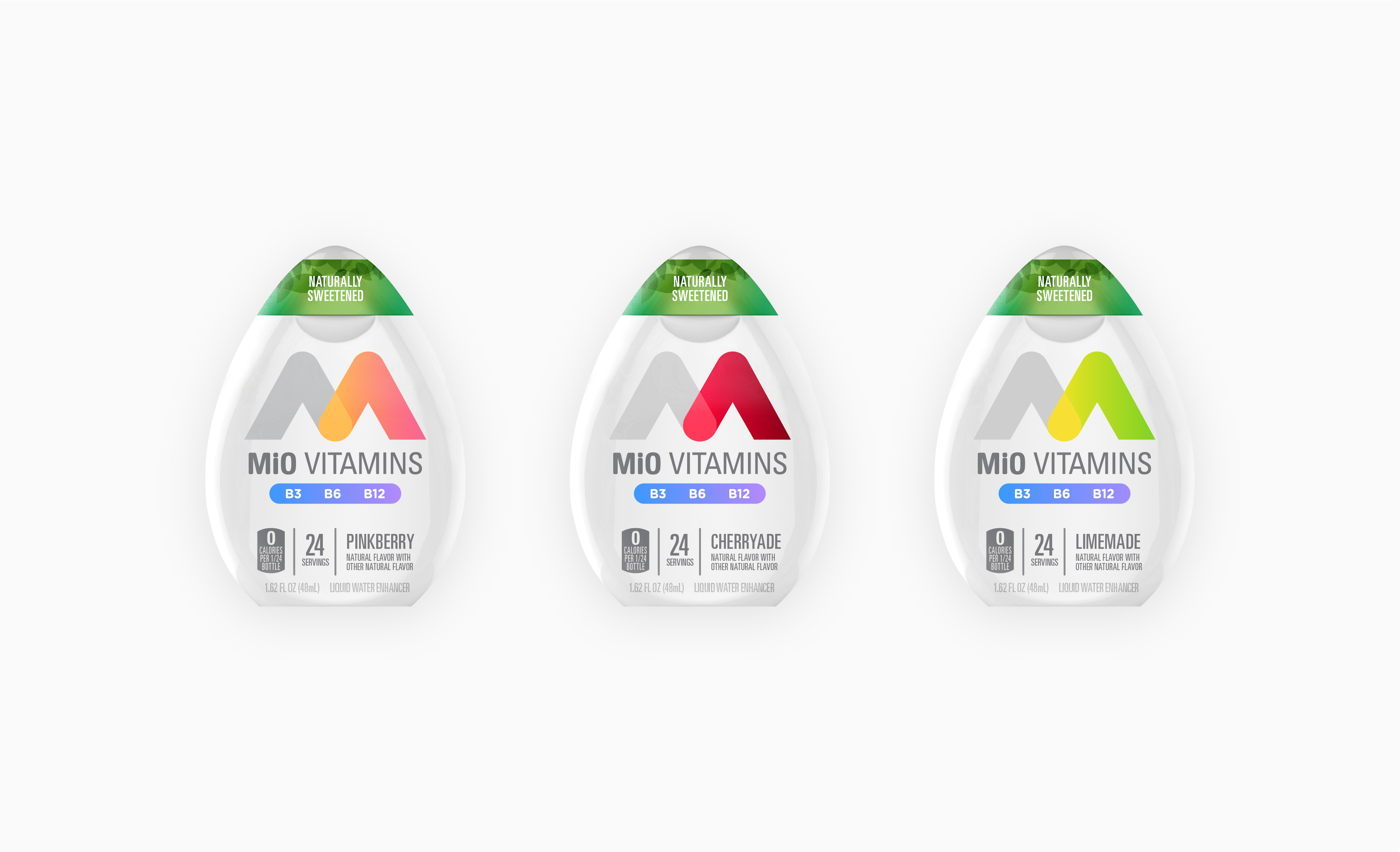
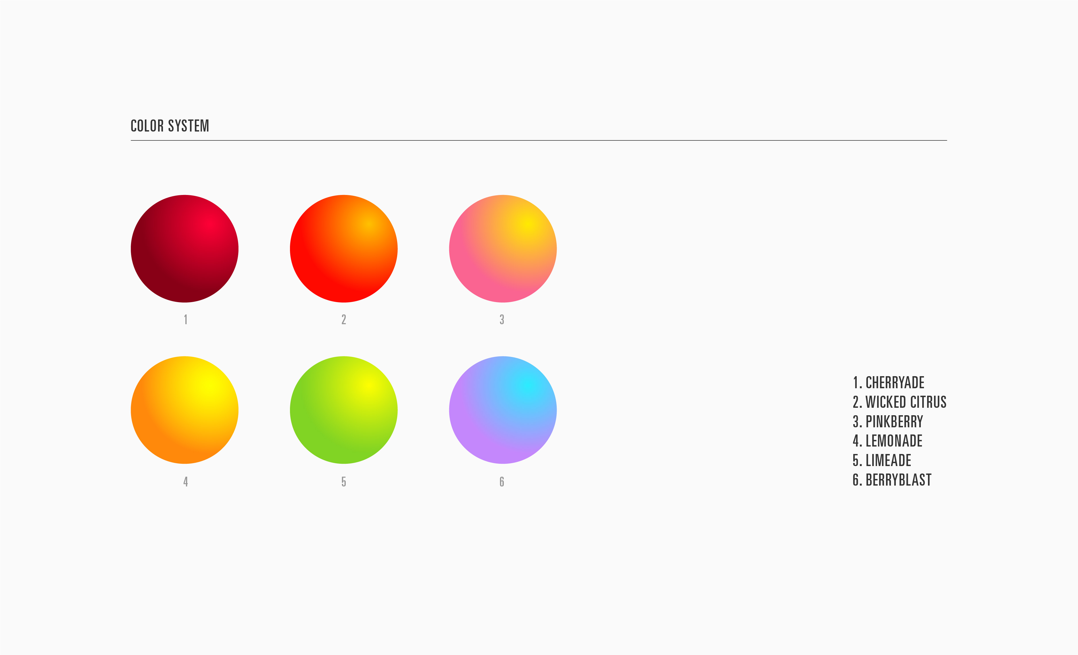
I started by exploring a variety of treatments to the MiO logo. Because the new product line's value prop was focused on living a healthier and more active lifestyle, I sketched with 3 themes in mind: electricity (energy), molecular structures (vitamins) and bending light waves (electrolytes). These themes weren't rigid nor mutually exclusive as the concepts themselves were very similar and only distinct by nuance.

Each bottle (2.25" x 3" x 1") required multiple pieces of disparate information. To solve, I created a systematic, scalable graphic that grouped similar pieces of information

Credits:
Creative Director: Rahmin Eslami
Client Services: Dani Stubbins
Designers: Chris Cullen, Jeremy Blake, Raphael Cala, Rachael Polack, Will Scharlott