
Using AI to Simplify Coordination in Messenger
Timeline:
December 2018 – May 2019
Collaborators:
Heath Black, Product Manager
Marion Boiteux, Product Marketing
Tiffany Young, User Researcher
Prince Gill, Akshay Patel, Bill Presant: Software Engineers
Overall Impact:
Launched in Australia on iOS & Android
Conducted user experience testing in Chicago, Los Angeles and Melbourne, Australia
My Impact:
Designed 8 flows for different M tasks
Designed and tested 5 education states
Led the creation of M's design principles
Led weekly M design sync with machine learning team
Problem: Planning a group meet up is hard. Lots of noisy back and forth and not enough clear facilitation.
Messenger group chats are commonly used to plan meet ups because all users (regardless of device) get to use the same features in the same way.
Users are also represented by their Facebook name/profile picture, whereas in SMS group chats, unsaved contacts appear as phone numbers.


Our team began by challenging assumptions and understanding real users' experiences

UNDERSTANDING THE PROBLEM
Planning can be noisy, confusing & overwhelming.
Everyone's multiple schedules, interests, and considerations make planning challenging.

What were the challenges?
"There's too many messages. It's so confusing. I don't want to make things harder."
"I just mute my group chat by default. It's a lot sometimes."
"Who has the final say when people want to do different stuff?"

The 6 meet up must-haves
Different demographics had different priorities for which factors were most important; teens prioritized coordinating their transportation plans whereas adults were more independent. People who lived in areas with unpredictable weather cared more about checking weather conditions than people who lived in areas where it was more consistent.
How could an AI in Messenger chats help reduce planning complexity?
MESSENGER LANDSCAPE
Leveraging Messenger M
M was Messenger's virtual assistant that suggested actions based on the chat.
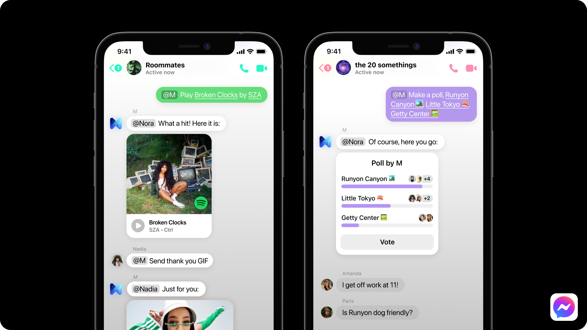
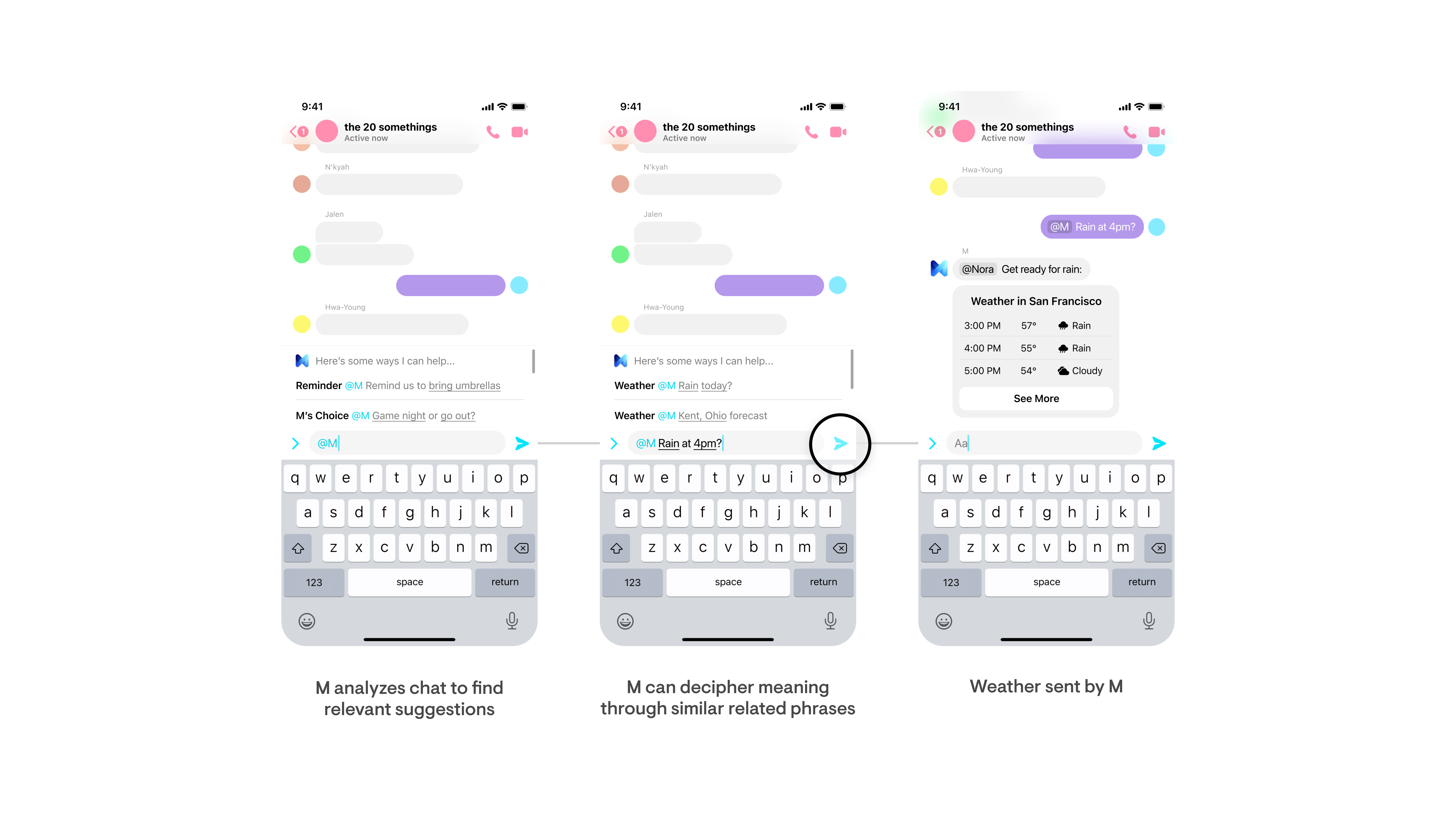
M's suggestions were always located at the bottom of the chat and didn't appear in the conversation. Our team proposed adding M into the chat itself by way of tagging — @M. This way, users could rely on M to help coordinate meet ups.


DEFINING OUR AI
I led the creation of M's design principles
It was important to involve all of our team members while defining our product's principles. I hosted a workshop including PMs, other designers, the data scientist, engineers, and the researcher to ensure everyone was aligned on M's principles. Defining this at the beginning of our process would guide decision making later on.
MAPPING SCENARIOS
Designing a natural journey
To develop flows between the users and M, I used a collaborative process with other designers where we spoke aloud the prompts to create a natural dialog and anticipate pain points in the flow. I used this dialog to map out the user's journey.


I drafted user flows to identify pain points and start conversations about the interactions
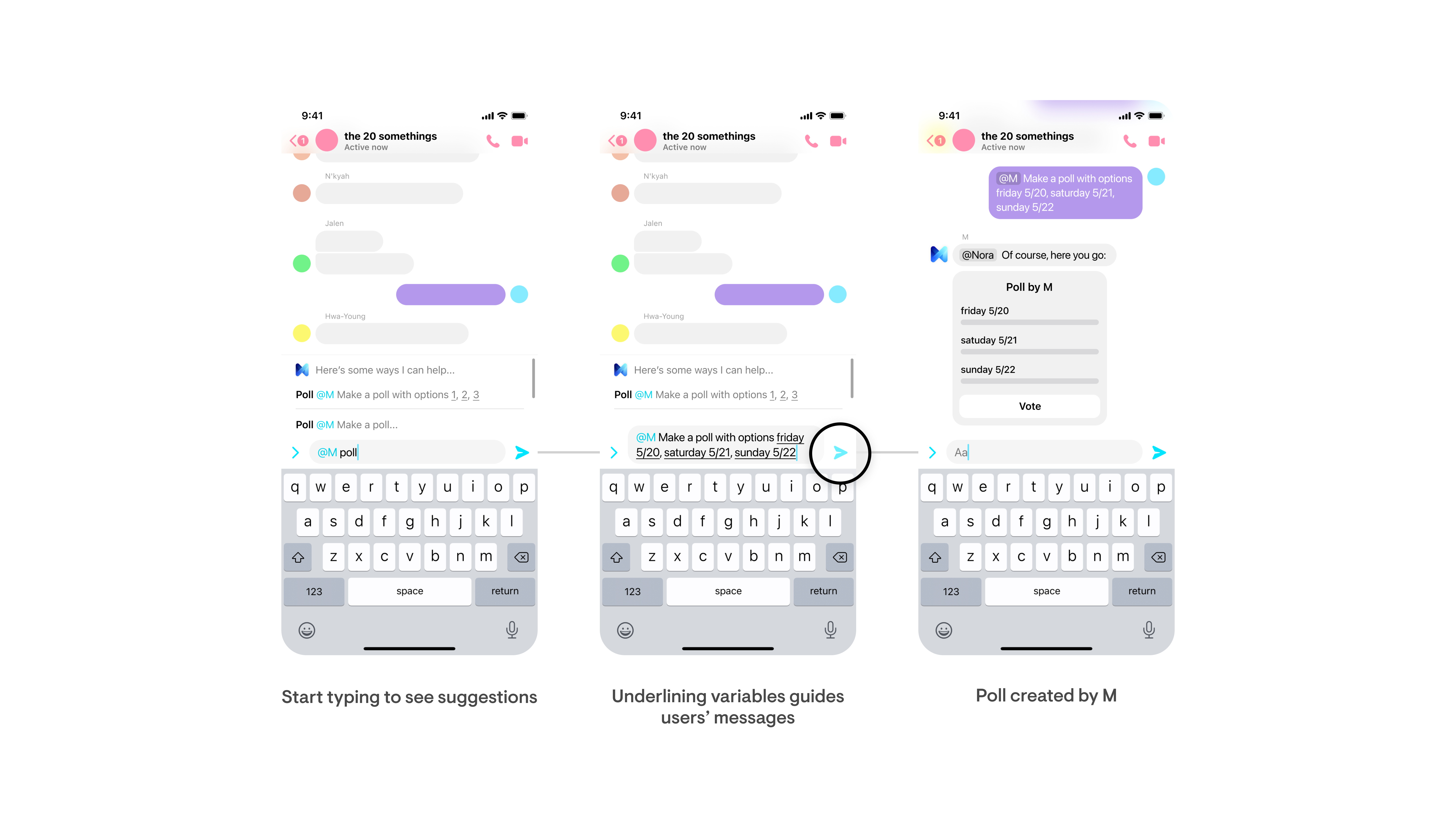
Creating a poll with M:

I partnered with Facebook's machine learning team to leverage their understandings
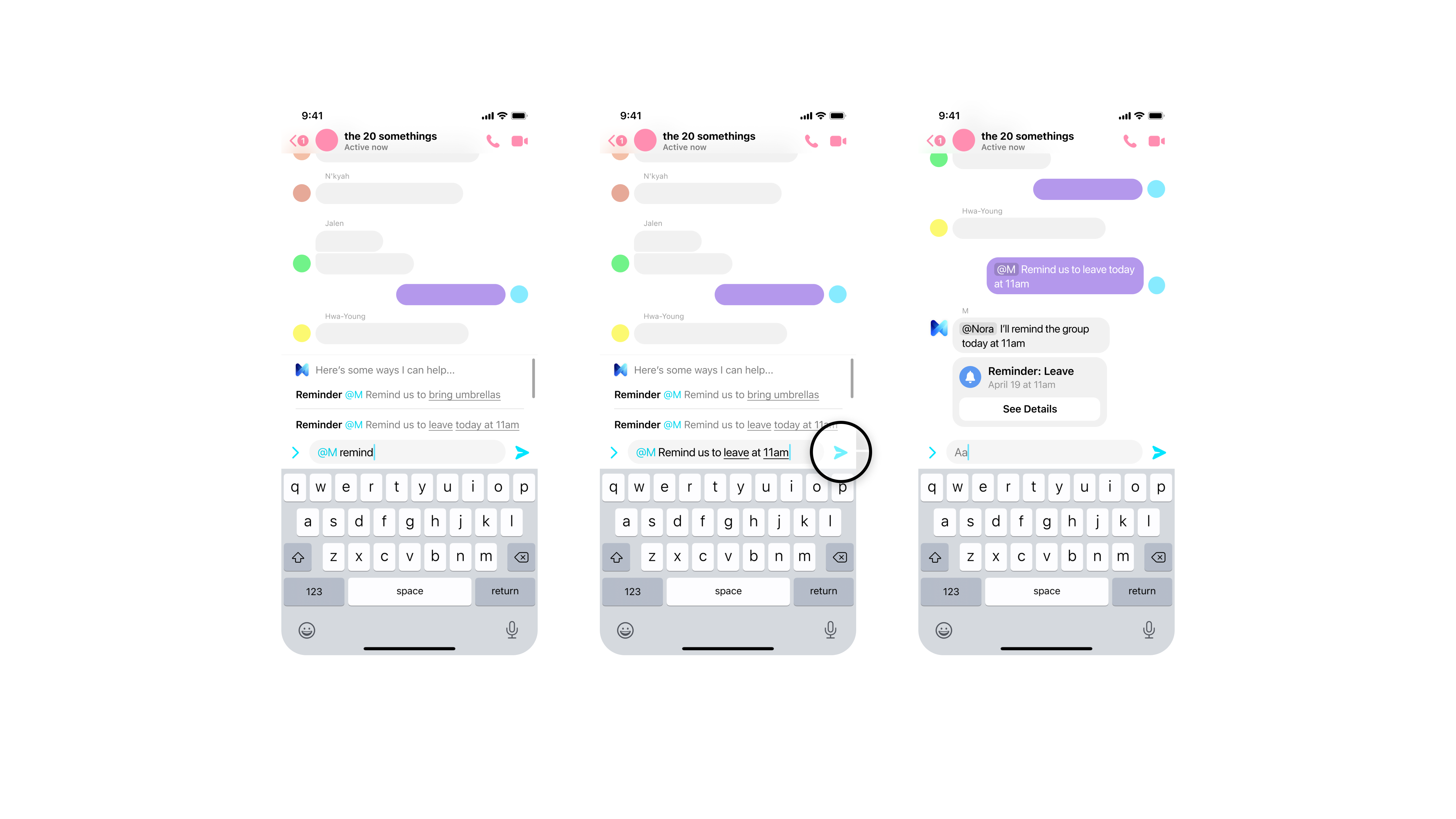
Creating a reminder with M:


When challenged about a choice I was making, I used the design principles to guide decision making
I designed interactions with generous margins of error and room for experimentation.
CONSIDERING THE E2E
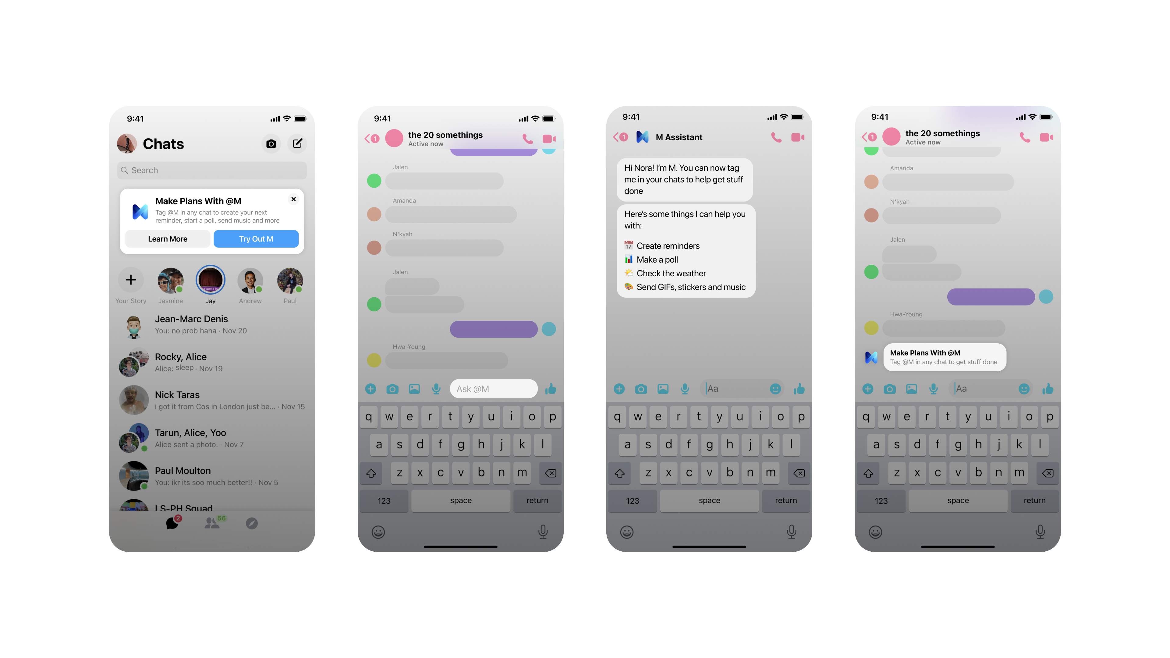
I designed 5 entry-points to introduce M to users
Another major challenge of this project was introducing users to @M and teaching them how to use it. There were two main issues:
1. Most users have never messaged with an AI, much less tagged one
2. Users weren't used to AI in their personal conversations
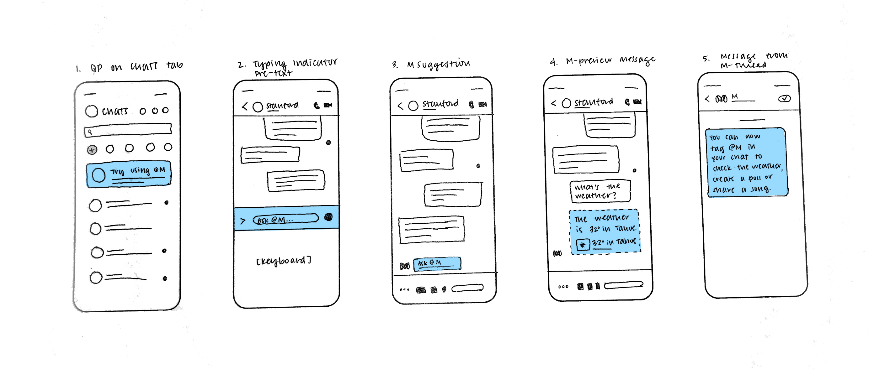

For minimal disruption, I designed the entry-points to meet users where they were by integrating education into existing surfaces

Demo of the "Let M Choose" feature
Prototype link
USER FLOWS
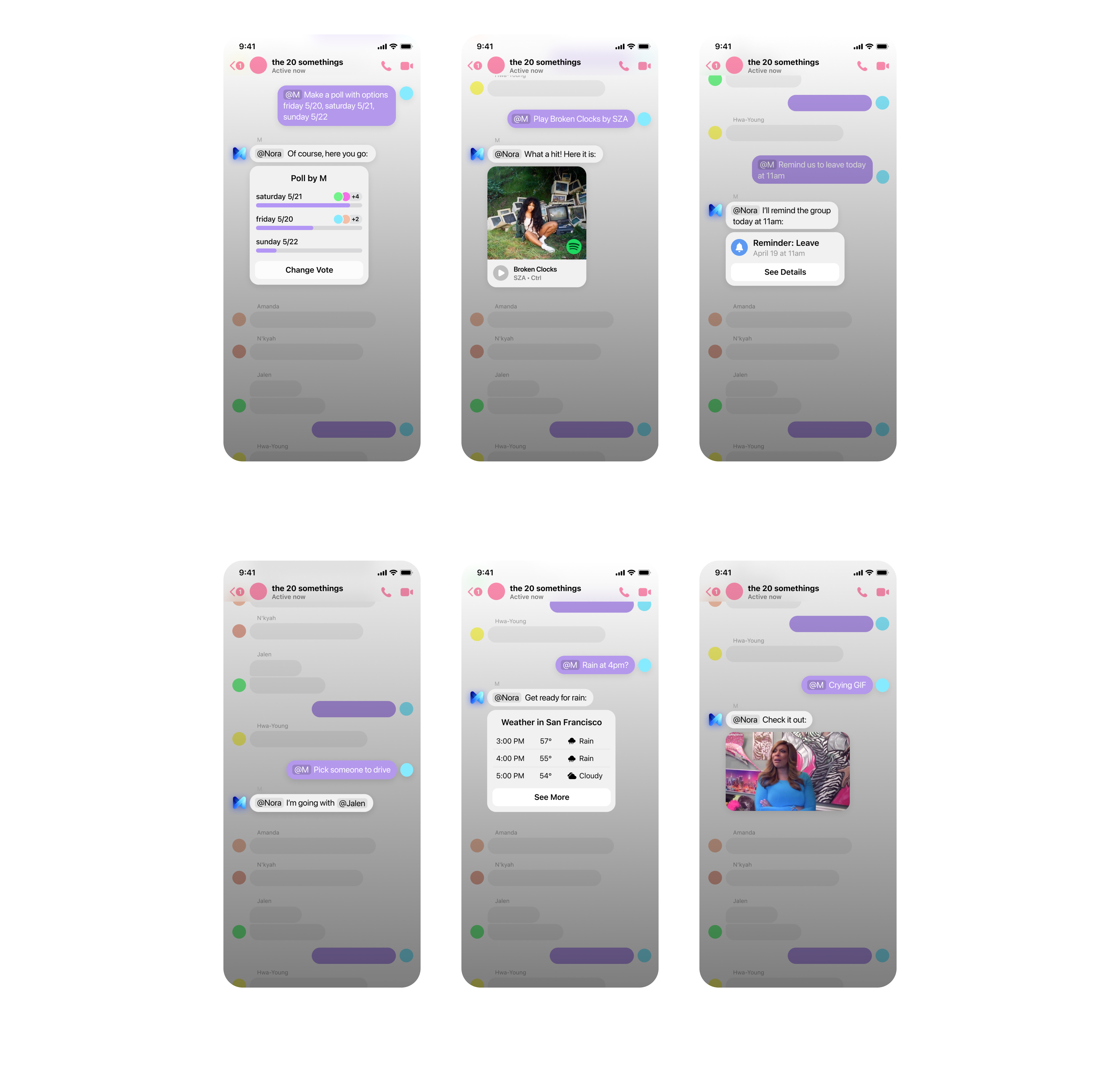
Tasks completed with M
Creating a poll

Creating a reminder

Checking the weather

ALL TASKS
All tasks


We conducted qualitative usability testing to gain empathy for users' pain points
USABILITY TESTING
We conducted 5 days of in-lab & in-home usability tests in Melbourne, Australia
With my team, I shared our product in beta with new users. Observing users and asking about their success and challenges while navigating M helped our team gain empathy for our next set of challenges.
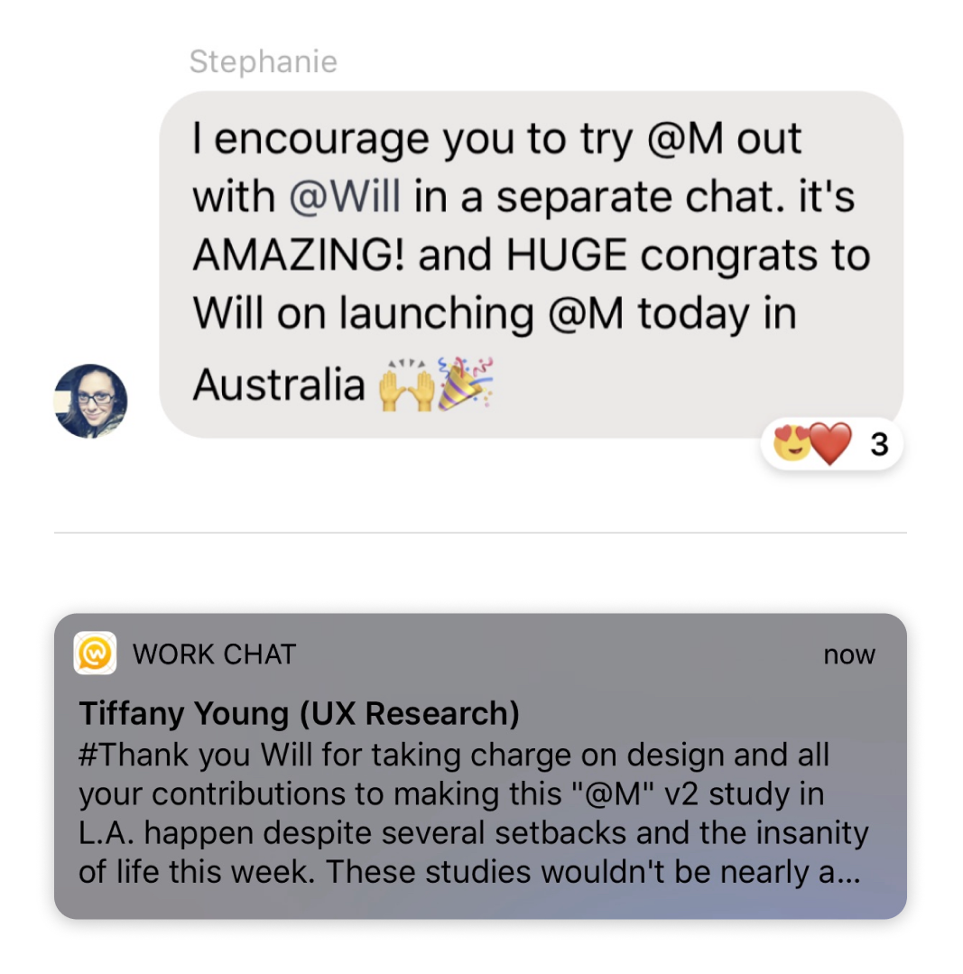
Based on our findings and no blockers, we launched the MVP product to Australia.
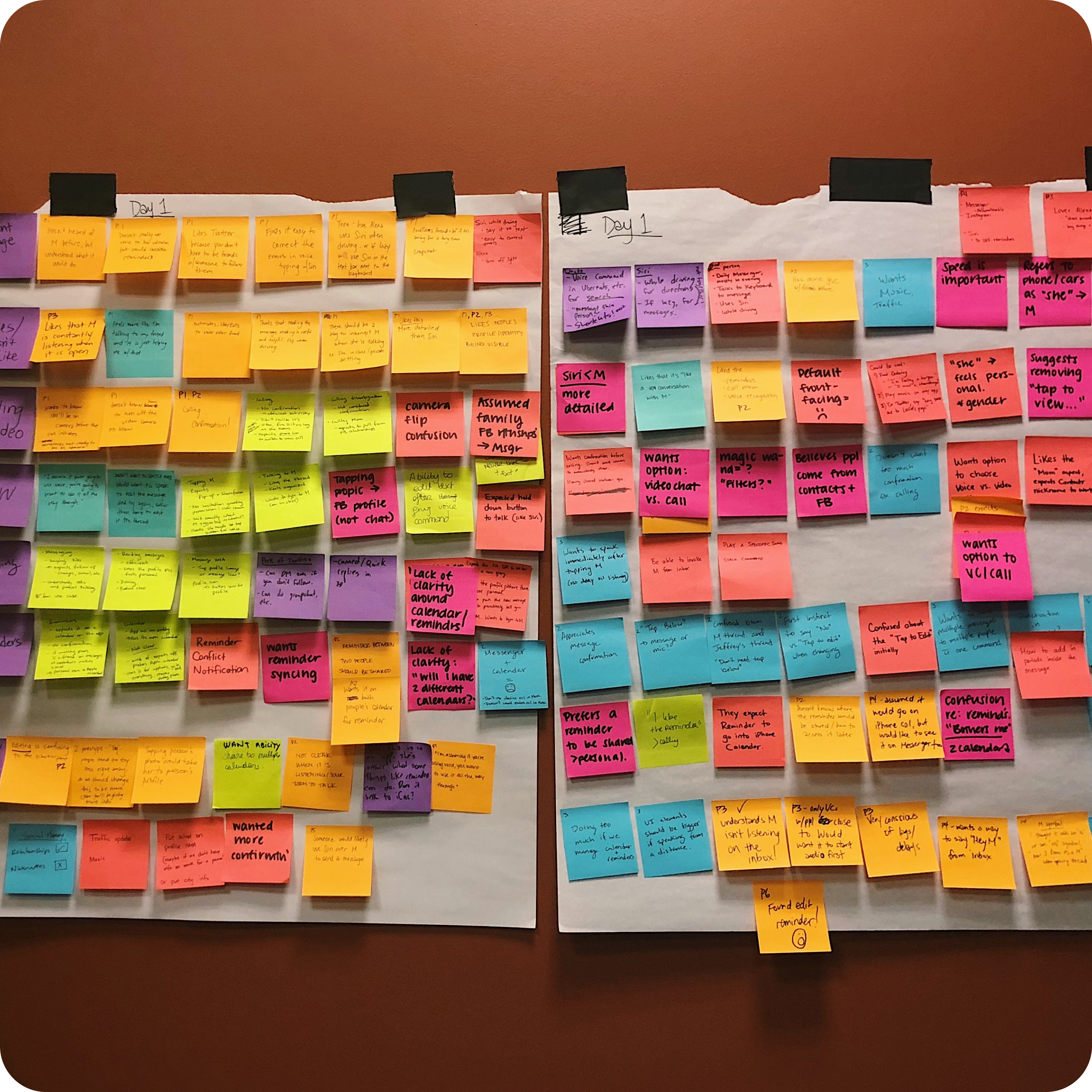

Users acknowledged many of the benefits but were somewhat uneasy towards the amount of AI in a personal & digital space.
Learnings
Most people don't know that they rely on AI every day. Getting an ETA while driving or tapping a suggested action based on previous behavior has become so normalized, it's easy to overlook AI when it's in front of us. Sitting down and listening to stories from people around the world, it was clear that the Hollywood-ization/dooms-day scenarios negatively affected people's perceptions of what AI was.
When people viewed the technology as contextually-based suggestions instead of "AI", they had fewer reservations about the concept. Personally, I understand and can empathize with these concerns.
After launching in Australia, M was cancelled as Messenger shifted priorities to Lightspeed. Had M continued, our team would have worked on adding trust signals throughout the experience to educate and empower people about the technology behind M and address concerns upfront.
